Want to see your home in different countries


I started with the wrong expectation.
I thought this would be one of those flashy design demos where everything looks impressive for five seconds and then falls apart the second you look closer. I expected fake luxury, random furniture, and the usual AI habit of confusing “style” with “throwing textures everywhere.”
Then I slowed down and used it the way a normal person would. I went into the locations section and started clicking through places the same way you’d browse neighborhoods when you’re half-curious, half-daydreaming. That changed the feeling completely.

The part that felt surprisingly real
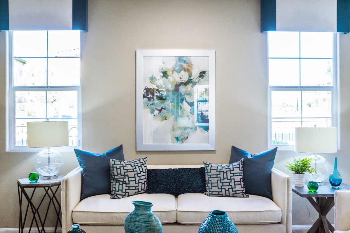
When the tool showed a Venice-style version of the room, it wasn’t just “Italian-looking.” It felt like the same space had picked up a different history. The room kept its basic shape, but the mood changed. That is the part I didn’t expect to care about, and that’s probably why it landed.
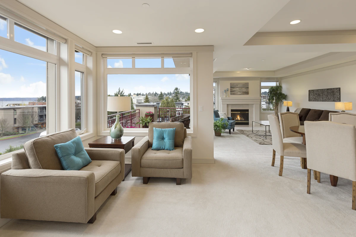
London felt tighter, moodier, a bit more polished. New Zealand felt more open and calm. Belgium sat somewhere in between, more restrained, a little softer, less dramatic. And Africa, at least in the way the tool interpreted it, leaned into earthier materials and a warmer feel.
The waiting part matters more than it should
There’s that 20 to 30 second pause while the AI does its thing, and weirdly that pause changes how you see the result. You click, you wait, and your brain starts filling in what it thinks is coming. By the time the image appears, you’re already comparing it to an expectation you made up on the spot.
But the better results weren’t just cosmetic. They shifted the whole tone of the room. Same bones. Different life.
What actually helped me use it better
The best way I found was stupidly simple: pick one room, keep the same photo, and only change the location. Don’t change the angle, don’t upload three versions, don’t turn it into a productivity project. Just stay with one image and watch how the place changes the feeling.
Once I stopped doing that, the outputs got easier to read. Venice became less about “pretty.” London became less about “expensive.” New Zealand became less about “light wood and plants.” They started feeling like different ways of living in the same room.


If I had to explain the value in plain language
That’s really it. The tool is not magic, and it’s not always subtle. But it does something useful very quickly: it helps you see how much “place” affects taste. Same room. Different world.
And yes, I did go back and re-check a few versions after thinking I was done. That’s probably the clearest sign the thing works. Bad tools get one glance. Interesting tools make you come back because your first opinion wasn’t the full story.
The countries that stayed with me
Not because they were “the best,” but because each one pushed the room in a clear direction.