I Tried AI Relighting on Architectural Renders. It Helped, but Not the Way I Expected.
I first used AI relighting because I had a decent exterior render that still felt dead. The model was fine. The materials were fine. But the image had no mood.
After a few bad attempts, I realized the tool is not magic. It is more like a fast lighting sketch. Used carefully, it can save a render. Used badly, it makes architecture look fake.


Where this actually started
I had an exterior visualization that should have worked. Clean building. Nice facade. Correct camera angle. Nothing was technically wrong.
But when I looked at it, I did not feel anything. It looked like a render that was waiting for approval, not like a place someone would want to live in, invest in, or show to a client.
The annoying part was that rebuilding the lighting setup would take time. Open the scene, adjust sun direction, tweak HDRI, check reflections, render again, wait, compare, repeat. I had already done that too many times.
That was the first useful lesson: AI relighting is not only for “fixing bad images.” It is also useful when the image is almost there, but the atmosphere is missing.
The first mistake I made: I pushed the effect too hard
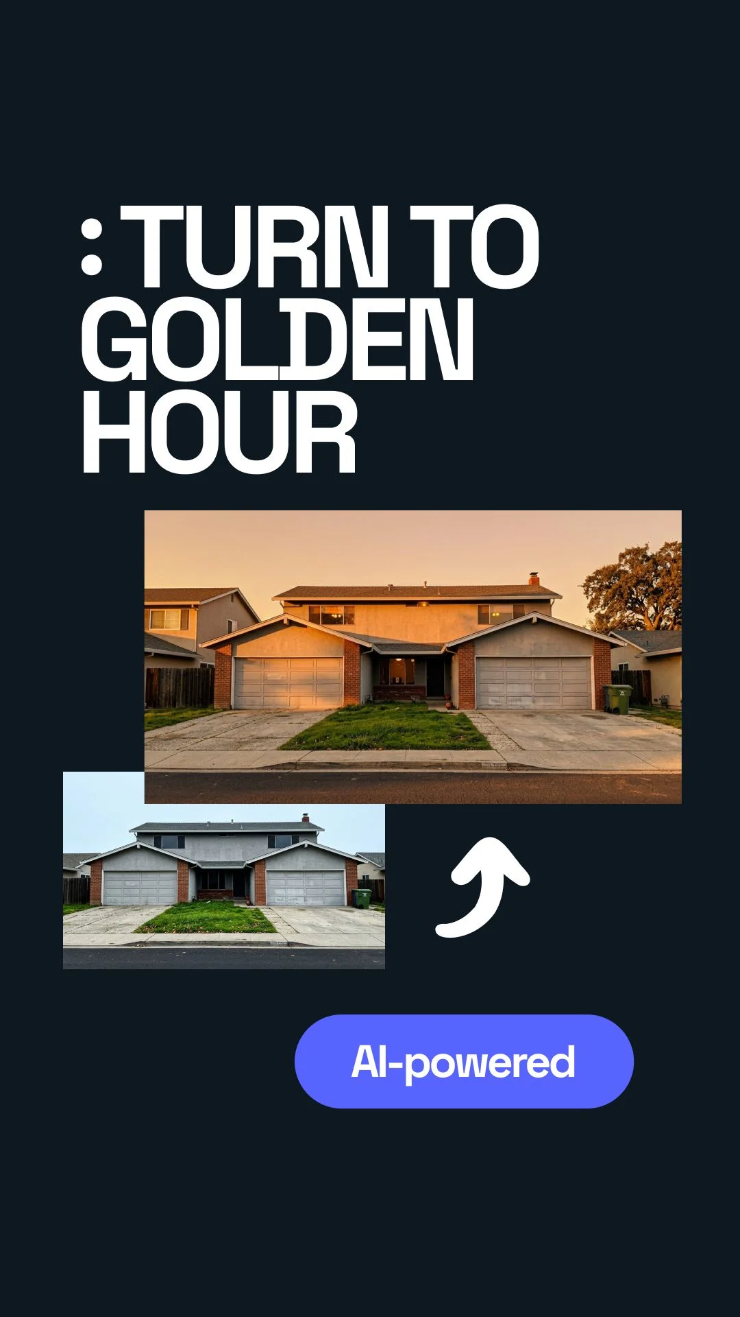
My first attempt looked exciting for about five seconds. I chose a warm golden hour style. The facade got warmer. The sky felt nicer. The shadows became longer. At first, I thought: great, done.
Then I zoomed in.
The glass reflections did not match the new sky. Some balcony shadows looked strange. The trees had a different light direction than the building. The image had mood, but it also had that small fake feeling you notice even if you cannot explain it.
What I expected
A quick upgrade from flat render to warm marketing image.
What happened
The image looked better at thumbnail size, but less believable when opened full screen.
That mistake was useful. It taught me that architecture is less forgiving than product photos. A bottle or chair can survive dramatic light. A building has glass, scale, shadow logic, trees, pavement, sky, and people. Everything has to agree.
What finally worked
The best result came when I stopped trying to make the render “beautiful” and started using AI relighting like a mood test.
I uploaded the image, picked a light style, waited around 20–30 seconds, and compared the result with the original. Not as a final image. Just as a direction.
That changed everything. I was not asking the tool to solve the whole render. I was asking one simple question:
Once I treated it like that, the results became useful. Sometimes I used the AI version directly with small manual cleanup. Sometimes I only used it as a reference and rebuilt the same mood inside the 3D scene.
The lighting presets that actually made sense for architectural visualization
I tried the obvious options first: golden hour, evening, and cloudy light. They all worked, but not for the same type of project.
Golden hour
This is the one everyone wants to like. It gives warm light, long shadows, and a “sold already” feeling.
Best for:- Residential projects
- Villas
- Resorts
- Marketing hero images
Cloudy light
This surprised me. It is less dramatic, but often more believable. Materials stay readable. Facades do not burn out.
Best for:- Urban projects
- Competitions
- Facade studies
- Planning documents
Evening light
This can look premium, but it can also become too cinematic. I use it carefully.
Best for:- Hotels
- Restaurants
- Luxury interiors
- Public spaces
I thought golden hour would be the obvious winner. It was not. For several exterior images, cloudy light gave the most professional result because it did not fight the building.
My simple workflow now
I keep it simple because complicated workflows are usually where I start wasting time.
- Start with a clean base render.
- Do not use AI to hide bad modeling or broken materials.
- Upload the render to the relighting tool.
- Test three moods: golden hour, cloudy, evening.
- Check the image at thumbnail size first.
- Then zoom in and check glass, shadows, trees, cars, and people.
- Keep the version only if the lighting logic still feels believable.
- Do small cleanup manually if needed.
That last question matters. A lot of AI images look good as a small preview. Architectural visualization has to survive full-screen review.
How I use it with clients
I do not present AI relighting as a magic final button. That creates the wrong expectation.
I use it as a fast option builder. For example, I might show the same exterior in three moods:
Option A: soft daylight
Safe, clean, realistic. Good for approvals and technical clarity.
Option B: warm sunset
Emotional, attractive, stronger for sales pages and brochures.
Option C: evening mood
More dramatic. Good when lighting design, interiors, or hospitality atmosphere matters.
Option D: keep original
Sometimes the original is still the best. That is part of the process too.
The real value is not only the final image. The value is the conversation. A client can react to mood faster than they can react to technical render settings.
Where AI relighting still breaks
I also made the same mistake twice: I trusted the first good-looking result too much.
The image looked nice, so I almost sent it. Then I noticed the building shadow was going one way, but the tree shadow was going another way. That kind of thing is small, but once you see it, the image is dead.
Here is where I am careful:
- Large glass facades
- Wet pavement
- Very sharp shadows
- Interior lights seen through windows
- Complex vegetation
- People close to the camera
- Night scenes with many light sources
And one slightly messy truth: sometimes the worse render improves more than the good render. That sounds backwards, but it happens. A flat image can gain mood quickly. A polished render has less room for AI to help and more ways for AI to damage it.
How this fits into a faster visual workflow with Uniify
For one image, AI relighting is just a useful trick. For a team producing many visuals, it becomes part of a faster creative workflow.
This is where a platform like Uniify makes sense: not as a replacement for designers, architects, or 3D artists, but as a way to move faster from raw visual to usable content.
Without a fast AI workflow
- One render mood takes hours to test
- Client feedback comes late
- Marketing images wait for final scenes
- Small changes slow the whole process
With AI-assisted relighting
- Several moods can be explored quickly
- Teams can test direction before rerendering
- Marketing gets options earlier
- Designers keep control over final quality
The important part is control. AI should speed up decisions, not make decisions for you.
A simple way to judge the result
I use this mental test now: would this lighting exist in the real world?
Not “does it look cool?” Cool is easy. Believable is harder.

If the answer is yes, I keep working with it. If the answer is no, I step back. The goal is not to make the render louder. The goal is to make the place feel more real.
Frequently asked questions
Can AI relighting replace proper lighting inside a 3D scene?
Not fully. A clean 3D lighting setup still matters. AI relighting works best as a mood test, finishing pass, or quick presentation option.
Is golden hour always best for architectural visualization?
No. Golden hour can look beautiful, but it can also make a building look too promotional or unrealistic. Cloudy light is often better when clarity matters.
Can I use AI-relit renders in client presentations?
Yes, as long as you check the image carefully. Look at shadows, reflections, windows, vegetation, and scale. Do not rely only on the first preview.
What type of render works best?
A clean exterior render with correct materials and simple lighting usually works best. AI relighting should improve atmosphere, not repair broken basics.
What is the main lesson?
Use AI relighting to explore mood quickly, but keep human judgment in charge. If the image feels better and still makes sense, it is useful.
Image and rights notes
Images embedded in this article use Unsplash source URLs for visual reference. Always verify the latest license terms and client usage requirements before using third-party visuals in commercial CMS pages.