
AI Interior Preview Guide
How to Replace a Painting in a Photo With AI Before You Buy It
The first time I tried this, I nearly bought the wrong painting. Online it looked perfect. In an AI preview of my actual room, it looked too small, too cold, and weirdly out of place. That was the moment this stopped feeling like a gimmick and started feeling useful.
Now I use AI for one simple reason: it helps me kill bad options before I spend money. I can test size, color, frame, and mood in my own space instead of guessing from a clean product shot.


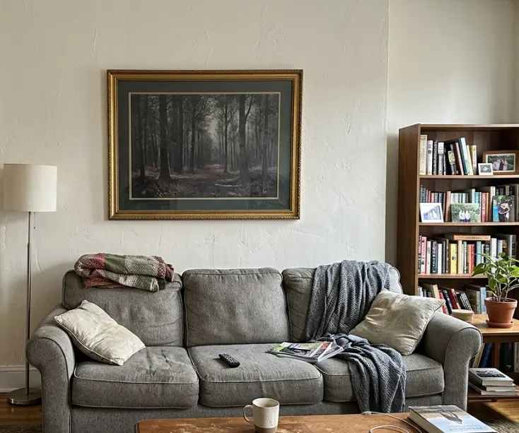
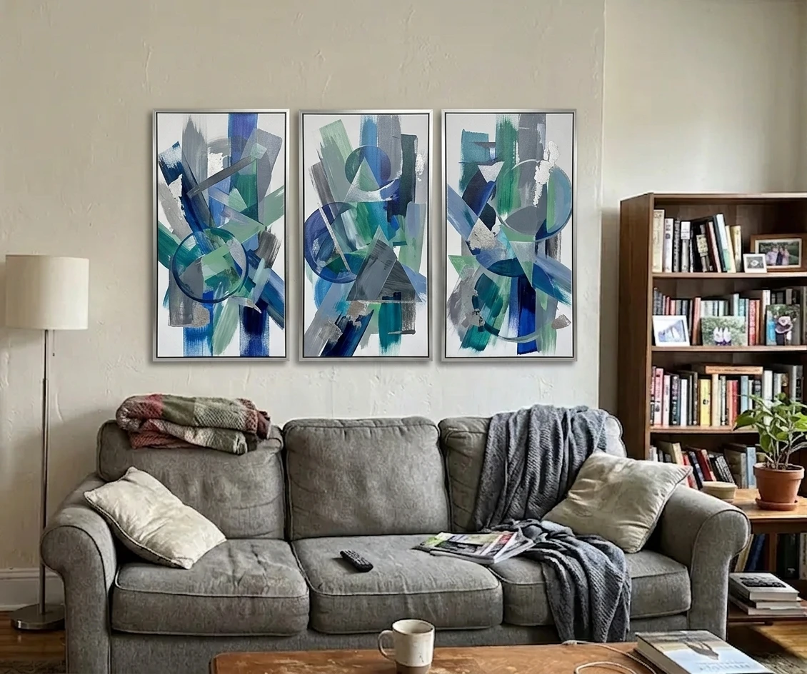
Transformed with AI by Uniify
The core idea
My problem was never finding art I liked. It was figuring out whether I would still like it once it was above my sofa, next to my curtains, in my light. I learned the hard way that a painting can look perfect on a white product page and still feel wrong in a real room. AI image editors helped because they let me change just the painting in my own photo instead of trying to imagine everything in my head.12
ROOM PHOTO
   ↓
Mark the painting or empty wall spot
   ↓
Say exactly what art you want
   ↓
Say what must stay untouched
   ↓
Generate 3 options: safe / bold / wildcard
   ↓
Compare with the original
   ↓
Buy, skip, or adjust
Why this works better than guessing
I did not get this at first. I thought I was choosing a painting. What I was really choosing was a relationship: art to wall, art to sofa, frame to trim, colors to rug and curtains, subject to the mood of the room. Once I started looking at previews in context, decisions got much easier.
Looking at a store listing
On a store page, almost anything can look convincing. The art is isolated, the lighting is flattering, and the scale is still mostly a guess. I kept liking pieces online that felt wrong the second I pictured them at home.
Looking at an AI room preview
In a room preview, the lies disappear faster. You can see if the frame is too heavy, if the piece is too small, or if the colors fight the room. It is not perfect, but it is much more honest.
That is also why this works at all: modern image editors are built to change part of an existing image, not redraw your whole room every time. OpenAI and Adobe both describe workflows built around targeted edits and prompt iteration, which is exactly what you want when you are only testing the art on the wall.13
What AI can and cannot do
What it is good at
- Ruling out bad directions before you buy
- Trying modern, abstract, classic, or minimalist styles quickly
- Seeing whether the piece feels too small or too dominant
- Testing warm, cool, neutral, or high-contrast palettes against the room
- Comparing frame and composition options without moving a thing
What it is not good at
- It is not legal proof that the final product will match exactly
- Recreating every exact brushstroke of a branded artwork
- Handling glare, blocked frames, or odd perspective very well
- Obeying the edit area perfectly every single time
I ran into that last one a lot. Even with a decent prompt, the AI sometimes touched the wall, the lamp, or the shadows around the frame. OpenAI’s own help notes say edits are not always perfectly precise, and that matched my experience almost exactly.2
So this is how I use it now: AI tells me whether the direction is right for my room. It does not replace checking the real size, material, frame, and finish before I buy.
Step-by-step workflow
1. Start with a room photo that gives the model a fair chance
This mattered more than I expected. The photo sets the ceiling for the result. My best previews came from bright, sharp room photos where the wall was easy to read. My worst ones came from moody evening shots I thought looked stylish.
Do this
Take the photo in daylight or in flat, even light. Keep the camera fairly level. Show the whole painting if you are replacing one. Leave some furniture in frame so the AI can read scale and style.
Avoid this
I kept getting bad results from blurry photos, strong glare on glass, super-wide phone shots, and anything where a lamp or plant covered part of the frame.

Why context matters
The room around the frame gives the model clues. That is how it guesses scale, texture, and mood. When I cropped too tightly, the replacements started looking less believable.
Image attribution: photo by De an Sun on Unsplash, available under the Unsplash License.
2. Define the edit narrowly
My early prompts were painfully vague. 'Change the painting' sounds clear to a person and almost useless to an AI. Better prompts name the exact thing to replace, the style, the colors, the size, the frame, and what must stay untouched.
Weak prompt
Replace the painting with something better.
Strong prompt
Replace only the current painting with a large horizontal abstract canvas in warm beige, muted rust, charcoal, and off-white. Use a thin black frame. Keep the rest of the room unchanged.
3. Separate the art brief from the room-locking instructions
This was the trick that made the biggest difference for me. I stopped writing one messy sentence and split the prompt into two jobs: what the new art should be, and what the room should not do. That cut down a lot of random changes.
Art brief
What the new art should look like.
Scene lock
What must stay exactly as it is.
4. Generate multiple directions, not one “final answer”
I thought I needed one perfect prompt. What I actually needed was three decent directions. Seeing them side by side taught me much more than chasing one 'final' render:
- Safe: the version you would probably never regret
- Stretch: a bit bigger, bolder, or stranger
- Wildcard: the one you think you will hate and sometimes end up liking
This is where the whole thing started saving me time. Instead of opening endless product pages and guessing, I could test three real directions against the same room in a few minutes.
5. Compare like a buyer, not like a spectator
This is where I stopped using AI like entertainment and started using it like a buying tool. 'Looks nice' is not enough. I run every version through the same annoying questions:
- Does the width actually make sense over the furniture below it?
- Do the colors support the room or fight it?
- Does the frame feel too heavy, too thin, too formal, or too casual?
- Is the artwork adding life, or just adding noise?
- Did the AI quietly change something nearby that I did not ask it to touch?
A practical shortcut
If you want a cleaner workflow, uniify.space is a good fit for this. You upload the room photo, describe the wall art you want, lock the rest of the scene, and compare before-and-after versions without accidentally turning the whole room into a redesign exercise.
A prompt formula that gets cleaner results
This is the simple prompt shape that started working for me:
Replace only [painting or empty wall area] with [artwork type].
Style: [modern / abstract / landscape / minimalist / Japandi / gallery-style].
Colors: [specific colors].
Shape and size: [vertical / horizontal / square] and [approximate visual size].
Frame: [thin black / oak / white / unframed canvas].
Keep unchanged: [wall texture, furniture, lighting, shadows, camera angle, room layout].
Goal: [realistic, premium, proportionate, believable].
This format worked better for me because it told the AI two things clearly: what to change, and what to leave alone. Adobe describes generative fill in almost the same way—modify a specific area while keeping the rest visually consistent.3
Example prompts you can paste and adapt
Modern abstract upgrade
Replace only the current painting with a large abstract artwork in beige, black, and soft terracotta tones. Use a slim black frame. Keep the wall, furniture, lighting, and camera angle the same. Make it look realistic and sized correctly for the wall.
Minimalist framed print
Swap the existing painting for a minimalist framed print with a thin black frame and soft neutral colors. Keep wall texture, shadows, and nearby furniture unchanged. Make it look believable, premium, and quiet.
Japandi-style wall art
Replace the artwork with Japandi-style wall art in muted earth tones, simple organic shapes, and a calm premium feel. Use an oak frame. Keep the rest of the room exactly the same.
Contemporary landscape option
Change the current wall art to a wide horizontal landscape painting with soft green, grey, and blue tones that suits a modern living room. Keep the wall, lighting, perspective, and decor unchanged.
Luxury gallery direction
Replace only the painting with a contemporary gallery-style artwork that feels expensive, elegant, and restrained. Use neutral tones with one deep accent color and a slim dark frame. Keep everything else untouched.
Accuracy-first version
Replace only the painting on the wall with a new framed abstract artwork in neutral tones. Keep wall texture, furniture, shadows, reflections, camera angle, and room layout exactly the same. Do not redesign the room.
Common mistakes that make the preview less reliable
Being vague
This was my biggest mistake. Words like 'better,' 'modern,' or 'luxury' feel clear in your head and mean almost nothing to the model unless you add color, frame, size, and mood.
Changing too much at once
Every time I also asked for a new wall color, new styling, better lighting, and a different sofa, the test stopped being about the painting and the result got sloppy.
Ignoring scale
I got fooled by this more than once. The style could be right and the size still completely wrong. A tiny print and a big statement canvas change the whole room.
When this method works best
- The wall area is clearly visible
- The photo is sharp and bright
- You are testing direction before buying
- You can describe the art in simple, concrete terms
- You care more about fit and mood than exact product cloning
When it may disappoint
- The frame has glare, reflections, or fussy details
- The wall is shot from a weird angle
- You need an exact match to a branded artwork
- The photo is dark, noisy, or cropped badly
- You hope the AI will guess your taste from one vague line
How to decide whether the new art is actually better
At some point I realized I needed a simple filter or I would just keep generating versions forever. So now I judge each preview using four boring questions:
1. Fit
Does it actually belong on that wall, or does it look awkwardly small or crowded?
2. Harmony
Do the colors pick up anything already in the room—wood, fabric, metal, paint—or are they fighting everything?
3. Contrast
Does the piece give the room some life, or does it just make the space busier?
4. Believability
Do the frame, angle, and shadows look natural enough that I trust what I am seeing?
If a version wins most of these, I keep it on the shortlist. If it only feels 'interesting,' I move on.
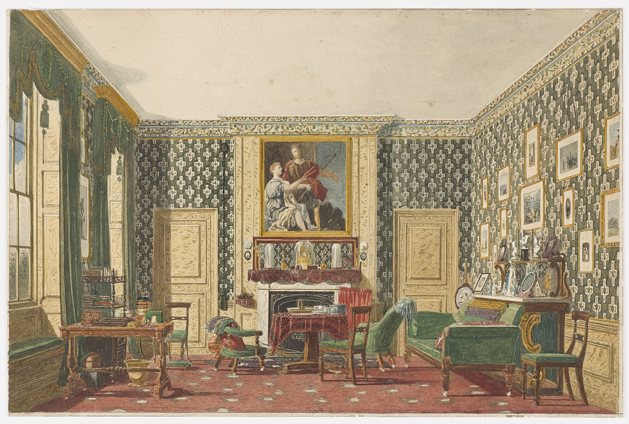
My main takeaway is pretty simple: I make worse art decisions when I judge the artwork alone. I make better ones when I judge it inside the room. AI did not replace taste for me. It just gave me a faster, cheaper way to spot my mistakes before I paid for them.
FAQ
Can AI show exactly how a painting will look in my room?
Not exactly. It can give you a very useful preview of scale, palette, and feel, but I would not treat it as proof that the delivered piece will match pixel for pixel.
What kind of photo should I upload?
Use the cleanest room photo you have: bright, sharp, and easy to read. Try to avoid extreme angles, glare on glass, and clutter blocking the artwork.
Why did the AI also change the wall or furniture?
Because the edit can spill a little beyond the area you care about, especially when your prompt is vague. The fix is simple: say exactly what must stay unchanged and keep the request focused on one thing.
How many versions should I test?
Three is usually enough for me: one safe version, one bolder version, and one wildcard. Most of the value shows up when you compare them side by side.
Is this better than buying mockups from a retailer?
For your own room, usually yes. Retail mockups show a generic interior. Your own photo shows your wall color, your furniture, your light, and your real proportions, which is what actually helps you decide.
References
- OpenAI, Image generation guide and image-editing capabilities for existing images and prompts. Official documentation.
- OpenAI Help Center, Editing your images with ChatGPT Images, including note that edits may extend beyond the specifically targeted area. Official product help documentation.
- Adobe Firefly Help, Use Generative Fill, describing object replacement and specific-area modifications while maintaining visual consistency. Official documentation.
- Unsplash, Unsplash License, allowing broad free use of Unsplash images. Used for the illustrative room photos in this article.
- Wikimedia Commons, Mary Ellen Best – An Interior – Google Art Project, public-domain artwork and metadata. Used for the historical interior illustration.
- Google Search Central, Article structured data and FAQPage structured data. Followed for the SEO pack and JSON-LD implementation.