
How to make house look expensive with AI IN SECONDS
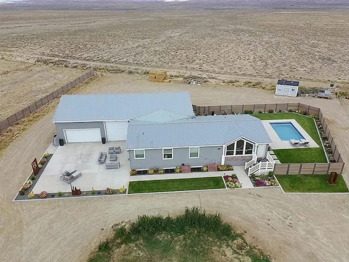
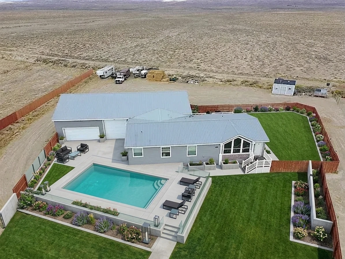
Transformed with AI by Uniify
How to Make Your Home Look Expensive with AI
Most homes do not look expensive because someone spent more on everything. They look expensive because the right things were handled well: lighting, materials, spacing, and restraint. AI helps because you can test that on a real photo of your actual space before you start buying, repainting, or regretting.
The short version: most rooms start looking expensive when they get cleaner, calmer, and more intentional. Better light, fewer finishes, less clutter, and a tighter palette usually do more than throwing in random “luxury” objects. AI is useful because it lets you test that on your real room in seconds.
That makes it practical for homeowners, real estate teams, Airbnb hosts, designers, and architects who want to see what is worth changing before real money gets involved.
Why some homes look expensive even when they are not
I learned this the hard way: a room can be full of expensive things and still look cheap in photos. What people read first is not the price list. It is the mood. If the light is flat, the finishes fight each other, and the room feels busy, the whole thing drops in value fast.
That is the main point. Premium is often about signal, not cost. When a space feels easier to read, easier to imagine living in, and less visually noisy, it starts feeling more valuable.
- flat ceiling light that kills depth
- too many finishes all competing at once
- furniture that feels off in size or spacing
- small clutter everywhere in the frame
- cold light on warm materials
- decor that looks random instead of edited
- layered light instead of one harsh source
- fewer finishes, chosen on purpose
- clean furniture shapes with breathing room
- less styling, but better styling
- warm controlled contrast instead of visual noise
- one clear focal point in the room
warmth, contrast, layering
stone, wood, metal, textile balance
less clutter, clearer focal points
same room, better signal


What AI can and cannot do
My first mistake was treating AI like a magic button. I uploaded a messy photo, wrote something lazy like make it expensive, and then acted surprised when the result looked fake. AI is strongest when it improves what is already there. It is weak when you ask it to behave like a contractor, engineer, and interior stylist at the same time.
- testing better materials before buying anything
- trying warmer, more layered lighting
- simplifying furniture and decor choices
- staging a room for listings or presentations
- showing what a more premium version of your actual room could look like
- accurate construction detailing
- moving walls with real technical confidence
- giving exact cabinetry dimensions
- respecting code by default
- guaranteeing every generated object can actually be built
Important: use AI as a fast decision tool, not as construction documentation. It should help you see what direction is worth exploring, pricing, or building. It should not be treated as a final technical package.
That is where a tool like Uniify makes sense. It keeps you anchored to your real room, exterior, or landscape image while you test better materials, styling, and atmosphere instead of drifting into fantasy renders that solve the wrong problem.
Before you generate: the photo matters more than people expect
The photo matters more than people think. I ignored that at first and kept feeding AI dark screenshots, blurry phone shots, and crooked wide-angle photos. Then I wondered why the room came back looking slightly cursed. If the source image is hard to read, the output gets weird fast.
1. Use daylight when possible
Daylight gives the model cleaner information about color, depth, and surface separation. It also avoids that muddy indoor look cheap bulbs often create.
2. Keep verticals straight
Avoid dramatic wide-angle distortion. If the walls already look bent, the furniture and geometry often go sideways too.
3. Remove obvious clutter
You do not need a showroom. Just clear the visual junk. The less noise in frame, the easier it is for the upscale direction to read cleanly.
Fast checklist before upload: wipe the lens, step back instead of forcing a fisheye look, turn lights on only if they actually help, and make sure the main sofa, kitchen, facade, or patio area is clearly visible.
How to prompt for a high-end result
Weak prompt: make it expensive.
Better prompt: say what should change, what should stay, and what “expensive” actually means in this room. The model needs direction, not vibes.
What usually happens: generic luxury soup. Random marble. Random beige. Random gold. Weird furniture scale. Not much connection to the actual room.
Why this works: the model knows what to preserve, what to upgrade, and what “expensive” means instead of guessing.
A prompt formula that actually works
Prompts you can actually use
Practical rule: ask for restraint. A lot of outputs fall apart because people ask for “luxury,” and the model responds like it is decorating a hotel lobby from a bad movie.
Room-by-room upgrade logic
Different spaces need different signals. What feels premium in a kitchen is not the same thing that feels premium on a facade or in a bedroom. I learned that after trying to force the same “luxury” recipe onto everything and getting very average-looking results.
Living room: premium means calm control
- simplify the furniture shapes
- remove small random objects from view
- add one or two richer textures, not ten
- use warmer indirect light for depth
- build one clear focal zone around seating, art, or a fireplace
Living rooms carry a huge amount of emotional weight in photos. If that one room feels calm and controlled, the whole property starts reading as higher value.
Kitchen: premium means material clarity
Cheap kitchens usually look cheap because too many hard surfaces are shouting at once. The fix is rarely “add more.” It is “edit harder.” Use AI to test a smaller set of better finishes: one stone, one cabinet finish, one metal tone, one backsplash idea.


Bedroom: premium means softness, shadow, and fewer interruptions
Bedrooms look expensive when they feel soft, quiet, and edited. Ask the AI to remove clutter, calm the contrast, add warmer secondary light, and make the bedding feel fuller and more tailored. Loud bedrooms rarely look premium. Composed ones do.
Exterior: premium means restraint and nighttime presence
On exteriors, “expensive” usually means cleaner lines, fewer awkward interruptions, better planting composition, and lighting that reveals form instead of flattening the facade. Good exterior lighting does not scream. It just makes the house read better.
- architectural lighting instead of floodlight glare
- cleaner planting masses instead of scattered pots
- darker trim accents for depth
- a simpler paving palette
- a clearer entry sequence and stronger focal front door
- too many little light points everywhere
- fake luxury materials stacked on top of each other
- an over-sharpened CGI look
- landscaping that turns into visual static
- night scenes so dark they stop looking believable


What actually makes a result look expensive
1. Fewer finishes
One good stone and one good wood usually beat six mediocre finishes fighting for attention.
2. Layered light
Ambient, task, and accent lighting create depth. One ceiling light usually creates disappointment.
3. Better scale
Rooms feel more expensive when furniture size and spacing feel intentional instead of accidental.
4. Controlled palette
Most premium rooms are tonally disciplined. They do not try to prove taste in every corner.
5. Surface contrast
Good spaces balance smooth and textured surfaces. All-flat feels budget. All-busy feels tired.
6. Visual editing
A lot of “luxury” is really subtraction. Remove the wrong thing, and the right thing finally has room.
Common mistakes that cheapen the result
- Using “luxury” as the whole brief. That usually gives you generic visual clichés instead of a believable upscale result.
- Letting the model redesign the structure by accident. If you want realism, say clearly that the room or facade must stay intact.
- Throwing in too many premium materials at once. Marble, brass, walnut, velvet, black steel, and fluted glass do not become elegant just because they showed up together.
- Ignoring the lighting. If the light is wrong, the finishes almost never read well.
- Trying to solve clutter with more decoration. More objects are not the cure for visual confusion.
- Treating the AI image like technical truth. It should guide decisions, not replace measured planning.
real photo
lighting + materials + styling + use case
premium visual scenario
what to keep, price, test, or build
When this works best
- preparing a property for sale or listing photos
- testing renovation direction before spending money
- improving Airbnb visuals without doing a full fit-out first
- showing clients premium design directions quickly
- creating portfolio or marketing visuals from real spaces
- rooms with extreme clutter and overlapping objects
- very low-resolution photos
- fisheye or heavily distorted camera angles
- requests for structural redesign and technical detailing
- spaces where measured joinery accuracy matters right away
Where Uniify fits in
If your goal is to see a more expensive version of your real space without breaking the underlying structure, Uniify is a practical place to do it. Upload a photo, describe the finish level and atmosphere you want, and test better directions before real budget gets burned in the real world.
Final takeaway
I used to think making a room look expensive meant adding more. More decor, more materials, more moves. Most of the time it was the opposite. Better rooms usually come from better choices in the places people notice first: light, material hierarchy, furniture scale, contrast, and editing.
That is why AI is useful here. It lets you test the premium version of your room before your wallet gets dragged into the argument. Use it to compare options, cut bad ideas early, and then move only the good ones into real sourcing, pricing, or renovation.
FAQ
Can AI make a cheap room look expensive?
Visually, yes. It can raise perceived value by improving light, materials, styling, and composition. That does not mean the room has been physically upgraded. It means you can preview a stronger direction before spending money.
Does this work better for interiors or exteriors?
Both can work well. Interiors often show a faster payoff because furniture, lighting, and surface changes are easier to read. Exteriors can improve a lot too, especially when lighting and landscaping are simplified.
What is the biggest prompt mistake?
Being vague. “Make it expensive” is not really a brief. Name the room, the style family, the materials, the lighting mood, and what must stay unchanged.
Is this useful for real estate listings?
Yes. Better staging and clearer visuals help people imagine the space more easily. That is exactly why premium-looking listing images and virtual staging matter in property marketing.
Sources and image rights notes
Research and factual references
- National Association of REALTORS®, 2025 Profile of Home Staging. Used for staging impact and room-priority statistics.
- NAR 2025 Profile of Home Staging report PDF. Supporting report source.
- U.S. Department of Energy, Strategy Guideline: High Performance Residential Lighting. Used for the logic of layered, integrated residential lighting.
- NIST, Evaluation of subjective response to lighting distributions. Used for the point that higher color rendering can improve perceived visual clarity.
- Uniify homepage. Used for product positioning relevant to this article.
Embedded image attributions
- Kitchen stone countertops, via Wikimedia Commons. License: CC BY 2.0.
- Marble countertops Winston Salem NC, via Wikimedia Commons. License: CC BY 3.0.
- Wall light, via Wikimedia Commons. License: CC BY-SA 2.0.
Rights note: always review the source page and license terms before republishing at scale, especially if your CMS, syndication, or social workflow modifies or crops images.
Editorial note
This article is a practical decision guide, not engineering advice. AI-generated previews should be treated as concept direction. Final build decisions still need real dimensions, materials, code checks, and professional judgment.