I almost renovated my facade based on vibes. Glad I didn’t.
I got to the point where I was ready to spend real money on the front of the house, and the truth is, I still had no idea what I actually wanted. I had screenshots. I had opinions. I had that dangerous feeling of “yeah, I’ll know it when I see it.”
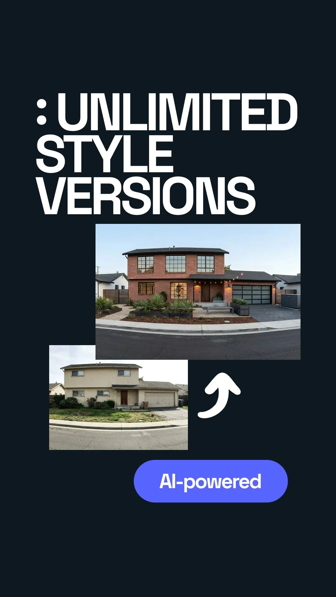
So I stopped before touching anything, uploaded a photo of the house, and started testing styles on Uniify.Space. That sounds tidy now. It was not tidy. I picked wrong things first, changed my mind more than once, and only later understood what I was actually looking for.


I was already halfway into the decision before I realized I was not ready
I remember standing outside, looking at the front of the house, trying to imagine new siding, darker trim, maybe a different entry, maybe stone, maybe not stone, and honestly it all felt fake in my head. I could kind of picture each idea for three seconds, and then the image would collapse.
That was the first useful moment: not when I had a vision, but when I admitted I didn’t. The house looked tired, but that didn’t mean every “upgrade” would help. Some changes would only make it look more expensive and more confused at the same time.
Mistake one: I picked the version that looked coolest, not the one that fit the house
I went straight for the sharpest style first. Dark trims. More contrast. Cleaner lines. Slight loft vibe. It looked great for about ten seconds. Then I looked again and realized the render was doing all the work, not the house.
The image was cool. My actual facade was still kind of awkward underneath. I was basically trying to dress bad proportions in better clothes and hoping nobody would notice.
The photo mattered more than I thought
I used a real exterior photo, not a cropped pretty angle. That helped a lot. The garage was visible. The weird entry proportions were visible. The bits I usually ignore were visible too. Annoying, but useful.
Once I uploaded the house as it really was, the style tests got honest fast. You click around, try a direction, wait a bit, and a new version comes back. From the outside it looks simple. Inside your head it is less simple, because now you are judging something real.
Use a normal daytime photo
Not dramatic light. Not a cropped corner. Show the whole facade.
Try a few real options
Loft. Rustic. Maybe one quieter middle ground. That is enough.
Compare your reactions twice
What feels exciting first is not always what feels right later.
Keep the house realistic. Clean up the facade. Add a stronger entry, better material balance, and a modern but believable exterior.
Mistake two: I got distracted by style names
I told myself I was choosing between “loft” and “rustic,” but that was not really true. I was choosing between feelings. One felt sharper. One felt warmer. The label was almost getting in the way.
At one point I kept clicking styles like I was shopping moods instead of solving a facade. I thought I was being thorough. I was mostly making myself noisier.
Loft
More contrast. Stronger edges. Cleaner feel. Great when the house already has decent shape to begin with.
Rustic
More texture. More warmth. More welcome at the entry. Easy to overdo if you keep adding “character.”
The in-between version
Usually the sleeper pick. Less dramatic. More believable. Often the one that ages best.

What actually helped was stupidly simple
I stopped asking which full style I wanted and started asking smaller questions.
- Does the entry look clearer or more lost?
- Does the garage calm down or become even louder?
- Do the materials feel like one idea or three random upgrades?
- Would I still like this after the first excitement wears off?
That gave me more clarity than all the dramatic renders combined.
I expected AI to give me the answer. It mostly gave me better questions.
I really thought I would upload the photo, click a few looks, get “the one,” and be done. That was the fantasy. What actually happened was more useful than that, even if it was less neat.
The fast versions showed me what I kept trying to ignore. Some ideas looked good only because they were new. Some looked bad only because I was not used to them yet. And some looked right in a very boring, calm way that almost made me skip past them.
Then I repeated the same mistake in a slightly different outfit
After I calmed down about the “cool” version, I swung too far the other way. I started choosing the safest, nicest, most inoffensive versions. Which sounds mature. It was also a mistake.
Safe is not the same thing as good. One of the options was so careful it barely changed anything that mattered. I could have spent a lot of money and ended up with the same house, just cleaner and more expensive.
Too much style
Feels exciting. Can turn fake fast. Often hides the house instead of helping it.
Too little change
Feels responsible. Can become a very costly version of “before.”
The insight that finally landed was smaller than I expected
The job was not to find the most beautiful facade in general. The job was to find the version of this house that looked most settled, most honest, and easiest to believe.
That changed everything. I stopped chasing style identity and started looking for visual calm. When I did that, the right direction became obvious much faster.
The simple workflow I’d use again
If I had to do it again, I would not overcomplicate it.
1. Upload the real house
Whole facade. Daylight. Minimal clutter. No fantasy angle.
2. Test three directions max
One sharp. One warm. One balanced. Stop there first.
3. Save only two finalists
One first choice. One backup. More than that gets messy again.
What I’d hand to a contractor
One preferred render, one backup, and a plain note: what stays, what changes, what still needs a real technical check.
What I would not do
I would not treat the render like a finished plan. It is a decision tool, not a permit set and not a materials list.
I also would not pretend I got there in a straight line. I did the usual human thing: got excited, got confused, called something “my taste,” changed my mind, and only then started seeing clearly.
Show three believable facade directions for this exact house: one loft-inspired, one warmer rustic-inspired, and one calm hybrid that looks modern without feeling forced.
FAQ
Can AI really help with a facade renovation?
Yes, if you use it to compare directions before you spend money. It is good at helping you see your own house in different styles. It is not a substitute for measurements, detailing, or contractor drawings.
What was the biggest mistake?
Choosing the prettiest image instead of the most believable one. A cool render is not automatically a smart renovation decision.
How many styles should I test?
Two or three is enough for most people. After that, the process starts feeling productive while actually becoming less clear.
What kind of photo works best?
A simple daytime photo with the full front visible and as little clutter as possible. The more honest the photo, the more useful the output.
Can I use the result when talking to contractors?
Yes. It is great as a briefing image. Just pair it with a short list of what stays, what changes, and what still needs a real technical review.
Sources and image credits
- Uniify.Space — platform reference for image-based style exploration and facade idea testing.
- U.S. Department of Energy — Where to Insulate in a Home for envelope context when facade changes affect walls, windows, and doors.
- Federal Trade Commission — How To Avoid a Home Improvement Scam for practical contractor and contract hygiene before renovation work starts.
- National Park Service — New Additions to Historic Buildings for compatibility principles when homes sit in historic or controlled contexts.
- Hero image: Wikimedia Commons, Timothy A. Gonsalves, CC BY-SA 4.0.
- Texture reference image: Wikimedia Commons, Warren LeMay, CC BY-SA 2.0.