
AI interior planning
AI Furniture Layout: Arrange Any Empty Room Instantly
The first time I tried to plan an empty room with AI, I thought the hard part would be picking furniture. It wasn't. The hard part was figuring out what the room was actually supposed to do before I filled it with stuff.
I made the usual mistakes fast: vague prompts, too many requests, one bad photo, and way too much faith in pretty renders. After a bunch of trial and error, I learned that AI is great at giving you layout directions early — as long as you stop asking it to magically “make the room nice” and start giving it a real job.



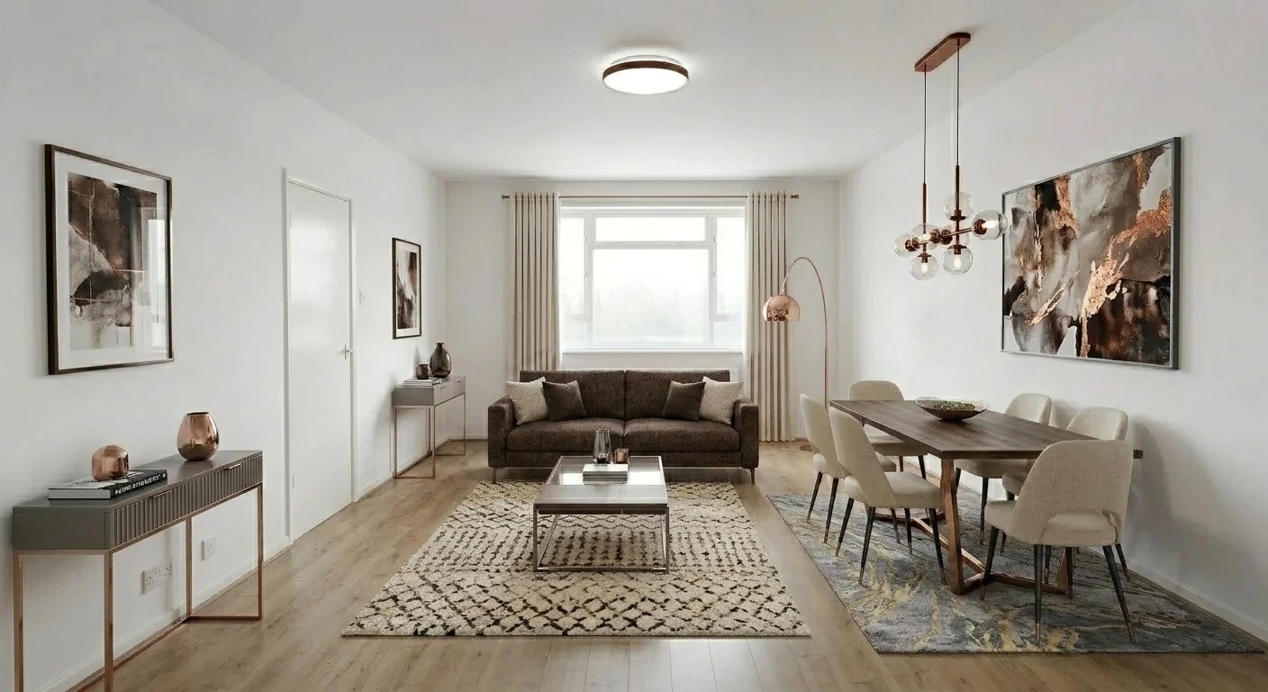
What finally clicked for me: AI is not a decorator that reads your mind. It is more like a fast planning partner. If you give it a room, a use, and a few real limits, it can save you hours. If you give it “make it look nice,” it usually gives you something that looks nice for about five seconds.
What AI furniture layout actually does
The first empty room I tested looked easy. Four walls, one window, clean floor, no furniture. I honestly thought the AI would nail it on the first try. Instead, it gave me a room that looked polished but made no sense once I imagined walking through it.
That was my first real mistake: I treated layout like decoration. I asked for style before I asked for function. So the room looked finished, but it did not work.
Once I started writing prompts around real use — TV watching, hosting friends, working by the window, keeping a path clear from the door — the results changed a lot. The AI stopped tossing objects into space and started building zones.
That is the useful part. A good AI layout does not just place a sofa and a table. It gives you a seating zone, a work zone, a dining corner, a path that feels open, and a room that seems like somebody could actually live there.
Under the hood, these tools are still doing the same basic thing researchers have worked on for years: reading room geometry from images and applying layout logic instead of random placement.[1][2]
What felt real to me
A layout with a clear purpose, believable walking space, and furniture that looked like a person could actually use it without bumping into everything.
What fooled me at first
A pretty render with a nice rug, a stylish chair, and zero thought for how you would get to the chair, open the door, or sit at the table.
How the method works
At first I treated the tool like a slot machine: upload photo, type a sentence, get a room. That was a dumb way to use it. The better way is to think in order: what is the room, what happens in it, what has to stay clear, then what furniture supports that.
The AI usually does best when the room itself is easy to read: straight walls, visible corners, normal perspective, decent light. That matches what room-layout research has shown for single-image reconstruction too. Simple rooms are just easier for a model to understand than weird, angled, cluttered ones.[2]
This is basically the loop that started working for me:

PHOTO
+ room type
+ what the room needs to do
+ must-have items
+ what needs to stay open

↓ AI reads the room

It guesses:
- walls
- depth
- openings
- likely movement

↓ AI proposes layouts

You compare:
- does it feel open?
- can people move?
- is the focal point right?
- did it overfill the room?

↓ keep one, fix the prompt, run again
The big shift for me was simple: the AI was never really “bad.” Most of the time it was answering a lazy prompt exactly the way I asked it to.
Step-by-step workflow for empty rooms
1. Start with a clean photo
This sounds boring, but it matters more than people think. One bright, wide photo with visible floor and corners gave me better layouts than three dark “nice looking” shots ever did.
2. Name the room honestly
Do not call it a “multi-use lifestyle space” if it is basically a living room with a desk. The clearer you are, the less the AI has to invent.
3. Describe what actually happens there
This helped me more than listing furniture. Watching TV, reading, hosting four people, working two days a week — that kind of detail changes the layout fast.
4. Add style, but keep it secondary
I used to lead with “Japandi” or “modern luxury.” Nice, but not enough. Style helps. Function decides whether the room works.
5. Add one or two real constraints
Things like “keep the window area open” or “leave a clear path from the door” helped the AI way more than long wish lists.
6. Generate more than one version
I almost never kept the first result. Usually the good version showed up after I saw what was wrong, fixed the prompt, and ran it again.
The practical takeaway: use AI before you buy the big pieces. It is a lot easier to adjust a prompt than to realize your new sofa makes the whole room feel blocked.
The prompt formula that produced better layouts for me
I kept waiting for some magical perfect prompt. That was another bad assumption. What worked was not “smart wording.” It was simple wording with the right details in the right order.
[room type] + [who uses it] + [main activities] + [must-have furniture] + [style] + [what must stay clear] + [anything important about light, doors, or windows]
What I wrote early on
“Make this room modern and cozy.”
That sounds fine until you realize it tells the AI almost nothing about how the room should actually work.
What started working
“Create a Scandinavian-style living room for TV watching and casual hosting, with seating for five, one coffee table, a wall-mounted TV, and open walking space from door to window.”
That gives the AI a job, not just a vibe.
Prompt examples you can actually use
Living room: Create a modern living room in this empty space with an L-shaped sofa, coffee table, TV zone, and clear circulation around the seating area. Keep it open and not overfilled.
Bedroom + desk: Design a calm Japandi bedroom with a queen bed, a small desk by natural light, wardrobe storage, and enough open floor space that the room still feels easy to move through.
Studio apartment: Arrange this studio with separate sleeping, working, and dining zones. Keep it minimal, use compact furniture, and do not block the window wall.
Open-plan room: Create a lounge and dining layout for four, with the sofa facing the TV wall and the dining table near the window while keeping a clear walking path through the room.
Three layout situations where I learned the most
Example 1: Empty living room
This is where I kept making the same mistake. I would get excited about the sofa position and forget the path through the room. The layout looked balanced until I imagined carrying groceries through it or having two people stand up at once.
WINDOW
┌───────────────────────────────┐
│  chair area      dining?      │
│                               │
│  sofa   coffee table    TV    │
│                               │
│  clear path from entry door   │
└───────────────────────────────┘
DOOR
The practical answer was simple: decide first if the room is TV-first, conversation-first, or mixed. Once I picked that, the rest got easier.
Example 2: Bedroom with workspace
I thought this one would be easy too. It was not. If I told the AI “bedroom with desk,” it often gave me a desk that technically existed but felt shoved in. What helped was saying whether the desk was for daily work, light admin, or occasional laptop use. That one detail changed the whole layout.
Example 3: Studio apartment
This is where I got a little ridiculous. At one point I expected one small room to be a bedroom, office, dining room, lounge, storage zone, and somehow still feel airy. The AI was not the problem there. I was.
The best habit I picked up: ask for three versions on purpose — one open, one high-capacity, one balanced. That gives you something real to compare instead of treating the first output like fate.
Real-world checks every AI layout should pass
This is where I got burned the most. A layout can look totally fine in a render and still feel annoying in real life. So now I always do one boring but useful check: can people actually move through this room without squeezing?
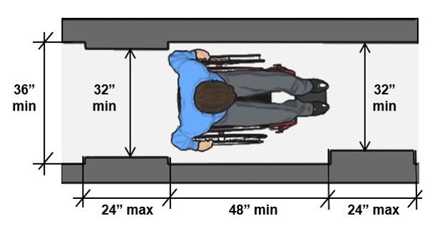
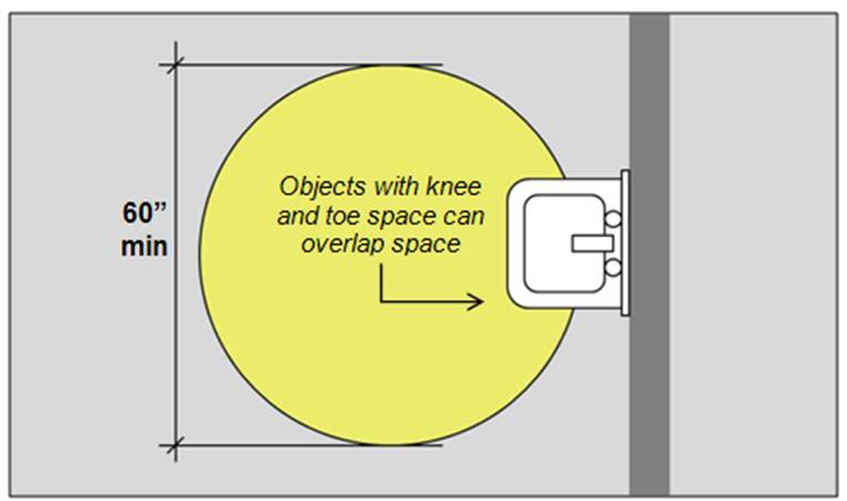
The numbers I keep coming back to are simple. The U.S. Access Board uses a 36-inch clear route as the baseline, with 32-inch tight spots allowed only in short sections, and it also shows a 60-inch turning-space reference for maneuvering.[3][4] For home planning, NKBA guidance also points to a 36-inch walkway and more room behind dining chairs when people need to pass.[5]
The quick check I use now
- Aim for about 36 in / 91 cm on normal walking paths.
- Leave extra room behind dining chairs if people need to pass.
- Check door swings, drawers, and anything that opens out.
- Be suspicious of any layout that only looks good from one angle.
What I forgot early on
- Radiators and outlets matter.
- Windows are not just background.
- A big rug can make a room feel tighter, not better.
- “Technically fits” is not the same as “feels good.”
Simple expectation: AI should help you see better options faster. It should not replace measuring, common sense, or the moment when you stand in the room and realize a layout just feels off.
Common mistakes that kept messing up my results
Being too vague
I did this a lot. “Make it nice” gave me exactly the kind of answer that sounds helpful and solves nothing.
Trying to fit everything into one room
I would ask for a sectional, desk, dining table, storage wall, reading corner, and open space in one small room and then act surprised when the result felt fake.
Using a bad photo
One dark photo can wreck the whole run. This was annoying to learn because it felt minor, but it really was not.
Thinking style would fix function
I kept assuming “minimalist” or “Scandinavian” would somehow clean up a bad plan. It does not. A bad layout in a good style is still a bad layout.
Trusting the first result too much
This might be the biggest one. The first version is usually a clue, not the answer.
When AI furniture layout works best, and when it starts to struggle
Where it helped me most
- Empty or almost empty rooms.
- Simple shapes with visible corners.
- Rooms with one main use or two clear uses.
- Early planning, before buying big furniture.
- Comparing directions, not chasing perfection.
Where it got shaky
- Odd layouts with angles, alcoves, or split levels.
- Very small rooms with too many demands.
- Cases where exact product dimensions matter a lot.
- Rooms where the photo hides key stuff.
- Moments when I expected the AI to solve a space that I had badly briefed.
Where a tool like Uniify fits in
What I like about using a tool like Uniify.Space is the speed. It makes sense right at the messy early stage, when you do not need a perfect final plan yet — you just need to stop guessing and start comparing real directions. That is also how the product is positioned on its official site: transform interior photos, stage empty rooms, and test design ideas before you commit.[6]
The workflow I would actually use: upload the room, run three prompt versions, keep one direction, then measure the real space before buying anything large.
Frequently asked questions
Can AI really arrange furniture from one empty-room photo?
Yes, especially in simple rooms. But “can” and “will get it perfect” are two different things.
Should I buy furniture straight from the AI layout?
No. Use it to narrow the idea down first. Then measure the room and the actual furniture.
What matters more: the style prompt or the function prompt?
Function, easily. Style helps the room look right. Function decides whether it lives right.
Why do empty rooms usually work better?
Because the AI can read the space more clearly and is not trying to work around visual mess.
What changed my results the most?
Writing prompts around use, flow, and what must stay clear instead of just asking for a certain aesthetic.
Sources and image credits
- Merrell, P. et al. Interactive Furniture Layout Using Interior Design Guidelines, Stanford / ACM Transactions on Graphics, 2011.
- Zou, C. et al. LayoutNet: Reconstructing the 3D Room Layout from a Single RGB Image, CVPR 2018.
- U.S. Access Board. Chapter 4: Accessible Routes.
- U.S. Access Board. Chapter 3: Clear Floor or Ground Space and Turning Space.
- National Kitchen & Bath Association. Kitchen Planning Guidelines with Access Standards.
- Uniify Space. Official product site.
- Hero image: “Empty apartment room with corner windows” by aismallard via Wikimedia Commons, CC BY-SA 3.0.
- Guidance images: U.S. Access Board diagrams on accessible routes and turning space, used here as official reference illustrations.
