
Interior Design • AI Tools
How to Preview Wall Paint Colors with AI Before Painting
I picked a wall color I was sure would look good, brought it home, painted a sample, and instantly knew I got it wrong. That was the moment AI stopped feeling like a gimmick and started feeling useful.
What helped was seeing the color on my actual room, with my own light, furniture, shadows, and all the annoying little details that paint cards never show.
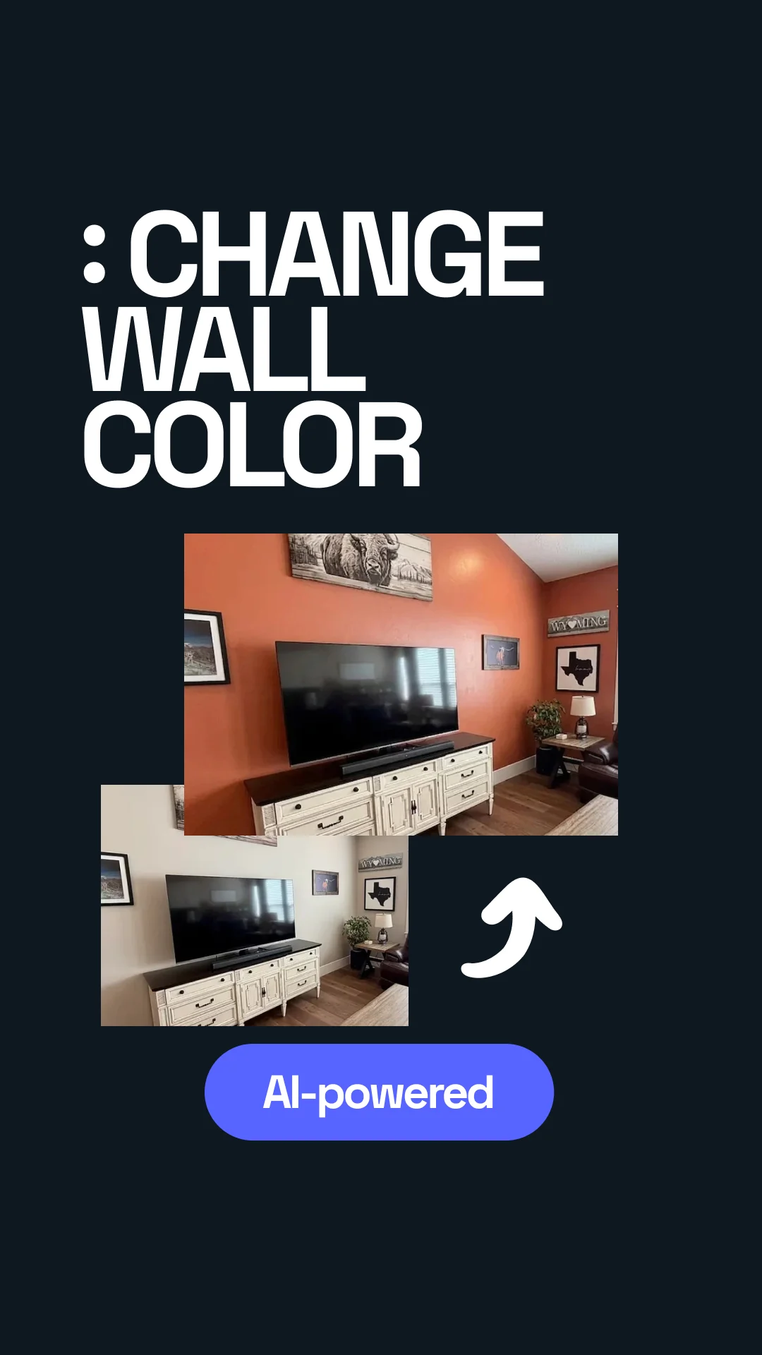

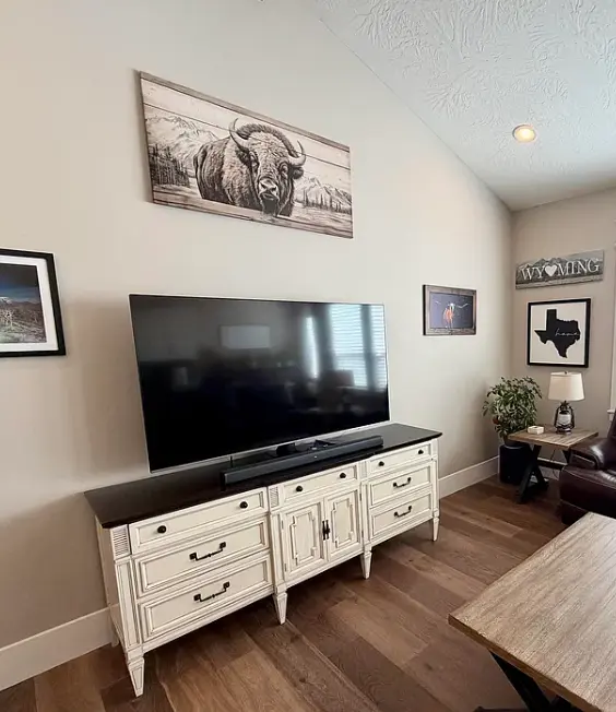
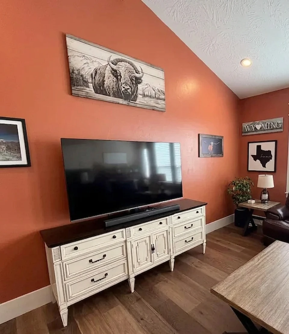
Transformed with AI by Uniify
What This Method Actually Does
The basic idea is simple: you upload a real photo of your room, tell the AI to change only the wall color, and use that preview to judge whether the color feels right before you spend money on paint.
- Your real lighting, not store lighting
- Your actual furniture and materials
- The shadows, darker corners, and reflections that usually ruin surprises later
Step-by-Step Guide
1. Upload a Photo
- Use a photo taken in decent natural light if you can
- Do not use filters or heavy edits
- Make sure the walls are clearly visible and not cut off
2. Open an AI Tool
I used an AI editor like Uniify, uploaded the room photo, and went straight to the edit prompt. Nothing fancy. The main thing is using a tool that lets you describe one controlled change instead of restyling the whole room.
3. Write a Precise Instruction
4. Answer Follow-Up Questions
- Style, if the tool asks for it
- Whether the room is mostly seen in daylight or at night
- Whether you want the color to lean warm, cool, soft, or crisp
5. Generate
- Fast tools can give you something usable in about 20 to 30 seconds
- Better renders can take a few minutes, especially if the room is detailed
6. Compare Results
- How the color sits next to your sofa, floor, cabinets, or curtains
- Whether the room suddenly feels darker or flatter
- Whether the space feels calmer, colder, warmer, cleaner, or just wrong
Example Prompts That Work
Apply a soft beige wall paint with warm undertones. Keep the furniture, layout, and lighting unchanged.
Change the walls to a deep navy blue with a matte finish. Do not alter the objects, textures, or lighting.
Test a modern white facade paint with a slight gray tint. Keep the roof, windows, and surroundings unchanged.
Generate two versions of the same room: one with light gray walls and one with charcoal gray walls. No other changes.
Common Mistakes (And Fixes)
Changing Too Much
This was my first mistake. I asked for a better-looking room, and the AI basically redesigned the whole place instead of just changing the walls.
Poor Image Quality
I also tried one dark, slightly blurry photo and got a result that looked fine at first glance but fell apart the second I looked at the corners and edges.
Ignoring Lighting
I thought once I found the right shade, that was it. It was not. A color that felt clean in daylight turned muddy under warm bulbs later in the evening.
Generic Prompts
Generic prompts are where things get weird fast. “Make it nicer” sounds harmless until the wall changes, the sofa changes, the mood changes, and somehow the room is no longer your room.
When This Works Best
- When you are repainting and narrowing down real options
- When you want a space to feel cleaner or more sellable before making changes
- When you want to compare a few close shades quickly instead of guessing from memory
Limitations You Should Know
- Rough brick, textured plaster, and uneven surfaces can still confuse the result
- Harsh glare, deep shadows, or night shots can push the color off
- Glossy or reflective areas are still tricky
And this is probably the biggest reality check: AI can help you rule colors in or out, but it still cannot fully reproduce how real paint finishes shift across the day. Matte, eggshell, satin, and gloss do not behave the same once they are actually on the wall.
FAQ
Can AI match real paint perfectly?
No, not perfectly. It gets you close enough to make better decisions, but real paint still reacts to light, texture, and finish in ways a screen cannot fully copy.
Do I need professional photos?
No. A normal smartphone photo is usually enough as long as it is sharp, well lit, and shows the walls clearly.
Can I test multiple colors?
Yes, and honestly that is where this method becomes most useful. Comparing two or three close shades side by side is much easier than trying to judge one color in isolation.