Field notes from a real AI redesign
I tried to turn a plain bedroom into an underwater room. Here’s what actually worked.
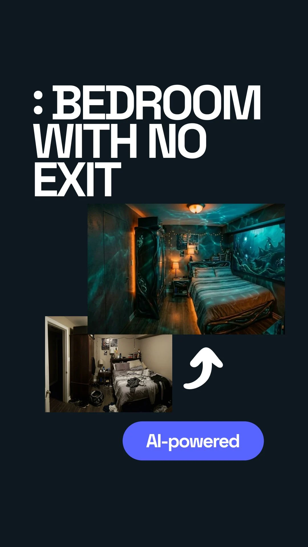
I started with a totally normal bedroom and one very specific idea: I wanted the room to feel ordinary until you stepped inside, and then feel like you had somehow landed underwater.
Not in a theme-park way. Not “ocean decor.” I wanted that weird, quiet, slightly unreal feeling where the walls stop reading like walls and the room feels deeper than it is.
So I uploaded the room into Uniify, started talking to the AI, got things wrong more than once, and slowly figured out what the room actually needed.


I was already inside the idea before I had the right words for it.
The room itself was nothing special. Bed, door, some clutter, regular walls, regular proportions. But I could already see the version in my head where none of that read as “bedroom” anymore. I wanted a screen on the side wall, a door that visually disappeared, and lighting that made the whole place feel submerged.
The feeling I was chasing was simple: you walk in and your brain needs a second to catch up. Not because the room is loud, but because it feels wrong in a good way. Quiet. Deep. A little disorienting. Like waking up in a place that should not exist in a normal apartment.
The first thing I got wrong: I treated the screen like the whole trick.
At first I thought the answer was obvious. Put a big display on the wall, show deep ocean footage, add an LED strip, done. In my head that already sounded immersive.
It was not. A screen by itself just looked like a screen. Even a large one. It read as tech, not atmosphere. The room still looked like a normal bedroom with a cool gadget bolted onto it.
Big image = big effect
I thought the wall display would carry the whole scene, so I kept staring at monitor size and placement like that was the answer.
The screen needed backup
The illusion only started working when the screen, the light, the door, and the empty space around them all started pointing in the same direction.
The conversation with the AI was more useful than I expected, but only after I stopped trying to sound clever.
I uploaded the room and started chatting with the AI. It asked the kind of follow-up questions I actually needed: what mood, what style, what should happen with the door, what goes on the screen, what kind of feeling should the palette have.
At one point it was replying in my browser language, which was fine, but I switched it to English because I wanted to see the wording clearly and keep the design notes clean. That part helped more than I thought. Once the language was consistent, the direction was easier to judge.
I also noticed something else: the AI kept forcing me to be more specific than I wanted to be. That was annoying for about ten seconds, and then useful. It was basically asking me to stop hiding behind aesthetic words and say what I actually meant.
I kept saying “make it surreal,” as if that meant anything.
I threw in words like surreal, cinematic, underwater, unique. All true. All useless on their own.
The AI pushed back with the right question: what does surreal mean here? Strange shapes? Floating objects? Broken geometry? Unreal textures? A calm abyss? A dramatic movie look? Once it asked that, I realized I was mixing five different ideas and calling it one style.
Same with the ocean part. “Deep ocean” sounds specific until you try to design with it. Do I mean dark blue? Green-black? Soft glow? Sharp contrast? Calm water? Scary water? I had not decided. I was hoping the mood word would decide for me.
What helped earlier than I expected was giving the AI jobs, not adjectives.
The moment things got better, my prompts got more boring in the best way. I stopped trying to sound inspired and started saying exactly what had to happen in the room.
Good prompt job
Put a slim LED screen on the wall to the left of the bed. Hide the door. Remove clutter. You can swap furniture if needed.
Better prompt job
Make the screen cover the full wall on the correct side. Keep the room clean. Mix warm and cool light so it feels cinematic, not just blue.
I honestly thought I would get one good result in half a minute and move on.
That was the fantasy. Upload room. Chat a little. Hit generate. Done.
And to be fair, the speed was real. The AI could produce options fast. It was quick enough that I could run several directions and compare them without losing momentum. But the idea that one run would solve the room? No. That part was me being lazy.
The first renders were not useless, but they were still wrong in ways that mattered.
One version had a cool atmosphere but the screen was in the wrong place. Another version did a good job hiding the door but the lighting felt generic. Another one looked dramatic, but not underwater. It had the mood, not the logic.
That was frustrating because each result was close enough to be tempting. I could have lied to myself and called one of them finished. But I knew I would hate it later, because the room would only look good in the render, not in real life.
The best version was never a single version.
That was the first real shift for me. I stopped asking, “Which render is the winner?” and started asking, “What is each render doing better than the others?”
Once I did that, the process got easier. One output gave me the hidden-door move. Another got the full-wall screen on the correct side. Another introduced the caustics that made the room feel like water was moving across it. The final prompt came from stealing the best decision from each one.
If I were doing this again on purpose, I would build the process around comparison.
I would not wait for one perfect generation. I would ask for several. Then I would label them like a normal person, not like a designer trying to sound smart.
Things worth stealing
Door treatment, screen placement, clean furniture layout, good shadow shape, believable caustics, warm-cool balance.
Things that fooled me
Overdone blue color, extra random objects, dramatic shapes with no reason, too much glow, “futuristic” details that killed the calm.
That sounds obvious now, but I did not start there. I started by hoping the machine would somehow read my taste from a loose paragraph. It could not. Once I gave it comparison data, it got much better.
The mistake that almost slipped through: a render can hide a door more easily than a real room can.
In one version, the door looked invisible. Great. But when I thought about the actual room, I realized the render was cheating for me. It was hiding contrast, simplifying edges, and making the wall feel cleaner than the room really was.
Same with the lighting. Pure cold blue looked “underwater” for about three seconds, and then it just looked cheap. The better direction was a mix: cool base light, a little warmth, and moving caustic patterns so the room felt cinematic instead of flat.
That changed the shopping logic too. I did not need ten exotic pieces. I needed a thin display, simple orange light, and a projector or effect source that could throw water-like movement across walls and furniture.
When it finally started to work, the room still looked like itself. That was the good part.
The cabinet was still basically the cabinet. The bed did not need to become some sci-fi object. The room was not transformed by replacing everything. It was transformed by changing what my eyes locked onto.
Once the door stopped shouting “door,” once the screen sat on the right wall, once the clutter dropped away, and once the caustic light hit the room at angles, the same furniture suddenly felt like it belonged to another place.
That was the moment I liked most. Not the flashiest render. The moment when the room felt like a hidden submarine cabin or some quiet underwater bunker without needing to explain itself.
I also had a very stupid middle phase where I thought maybe the answer was just “more weird.”
I genuinely had that moment where I thought: maybe I should add more floating objects, stranger textures, more broken geometry, more glow, more everything. Like maybe the room was failing because it was not bizarre enough.
That was nonsense. I was not designing an underwater room anymore. I was designing three different rooms at once and getting annoyed that they would not merge into one clean image.
I basically wanted a submarine, an art installation, a luxury bedroom, and an aquarium wall in the same five square meters. Which, yes, was the problem.

The room did not need more ideas. It needed one believable lie.
That is the part I would keep if I had to throw everything else away. The room only became convincing when I stopped piling concepts onto it and started protecting one simple illusion: there is more depth here than there should be.
For me, that came from a fake opening into deep water, a door that backed off visually, and light that moved across the room like water was touching it. That was enough. Once those three things were in place, the rest could stay simple.
And that is probably why the final version stuck with me. It was still a bedroom. I could still imagine living with it. But it also had that strange second where you walk in and think, wait, what is this place?
Questions I would ask if I were starting from scratch
Do I need a perfect room photo to begin?
No. You need a clear one. The AI just needs to understand the walls, bed, door, and floor well enough to place things in a believable way.
What should I describe first: the look or the feeling?
Start with the feeling, then turn it into room jobs. “Feels underwater” is useful only after you translate it into actions like hiding the door, calming the room, and adding moving caustic light.
How many versions should I generate?
More than one. The strongest result usually comes from mixing the best parts of several outputs instead of treating one render like the final answer.
What made the biggest difference in this concept?
The caustic-style lighting. Not because it was flashy, but because it changed how the whole room behaved, not just how one wall looked.
Where does Uniify help most in this process?
Right at the start and in the middle: upload the real room, test directions, remove visual noise, relight the scene, and keep refining until the concept stops fighting itself.
Visual sources used in the page
- NOAA / Monterey Bay National Marine Sanctuary. Kelp forest image used as mood reference in the hero section. Embedded from source URL for editorial visual context.
- Wikimedia Commons. Caustics image used to illustrate the light effect that helped the room feel submerged. Embedded from source URL for explanatory context.