
Exterior Paint + AI Visualization
How to Use AI to Choose Exterior House Paint Colors Without Guessing
The first time I tried this, I picked a white that looked clean on screen and somehow icy and flat on the house. Then I tried a darker trim, and the trim almost disappeared. Then one AI render “helpfully” painted parts of the brick I was never going to touch. That was the moment I stopped treating AI like a magic answer and started using it for what it is actually good at: killing bad options fast.
That is the whole game, really. AI will not hand you a perfect paint formula. What it can do is show your color ideas on your actual house, with your roof, your trim, your brick, your shadows, and your landscaping. Once I used it that way, the process got much easier.
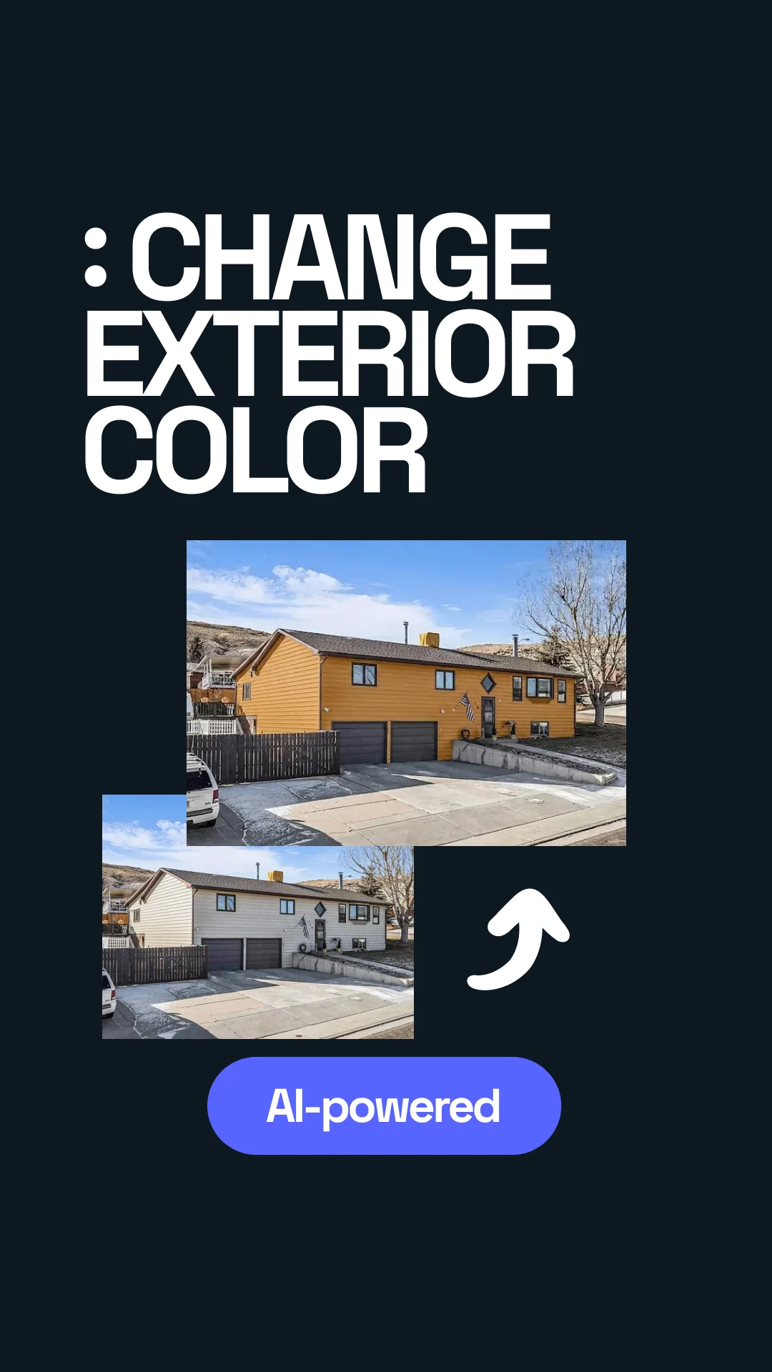


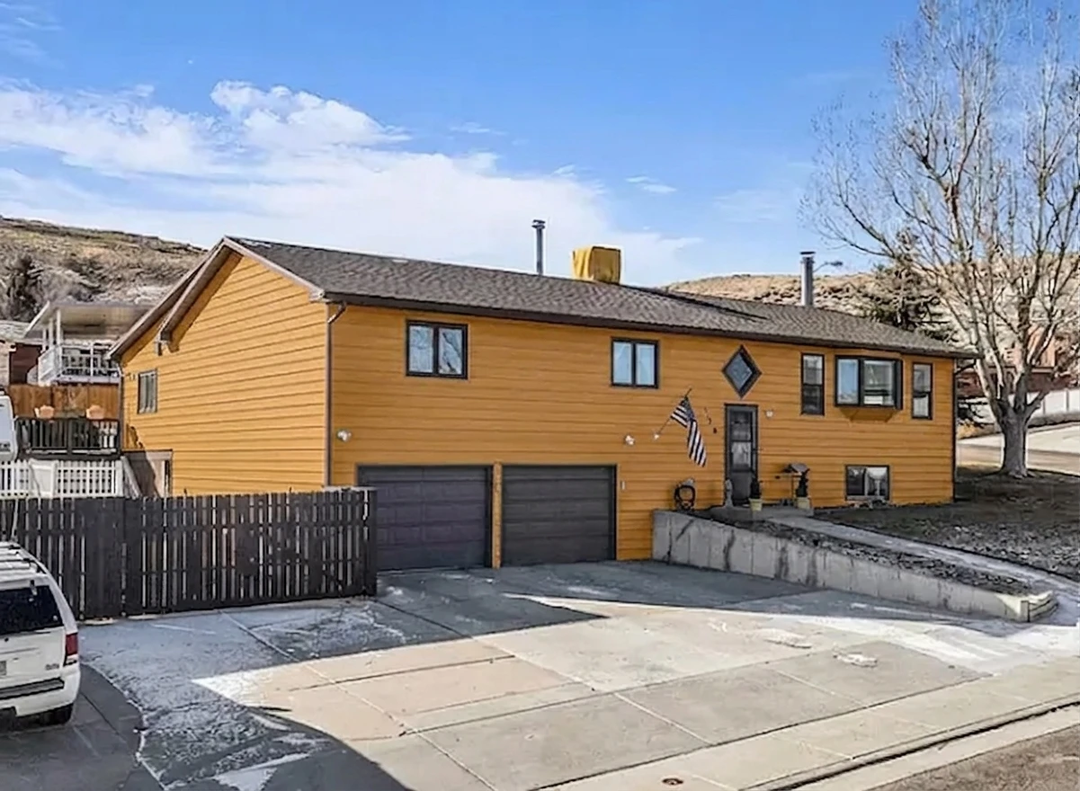
Transformed with AI by Uniify
I started with the wrong question
I thought the question was, “What color looks best?” That sounded reasonable, but it was the wrong question. The better question was, “What still looks right once the roof, brick, shadows, and trim are all in the picture?” Paint brands say the same thing in a more polite way: start with what is not changing. In real life, the roof and masonry usually boss the whole palette around.
My first mistake was looking at color chips and AI renders like they were little beauty shots. I was reacting to single colors. The house was reacting to undertones. A white with a cool lean looked fine by itself and wrong next to a warmer roof. A nice gray looked “modern” until it met the stone and suddenly felt dead. I did not need more options. I needed fewer bad ones.
What I expected AI to do
- Pick the best color for me.
- Make the house look instantly better.
- Give me one winning render I could trust.
- Save me from buying sample pots.
What it actually did well
- Showed me which ideas died on contact with the roof.
- Made undertone clashes obvious faster.
- Helped me compare contrast levels side by side.
- Got me down to a short list worth testing outside.
The big shift: I stopped asking AI for “the answer” and started asking it to show me three believable directions on the same house. That was when it became useful.
What finally worked for me
Once I calmed down and stopped chasing the first pretty render, the process got simple. Photo first. Fixed elements second. Three directions, not one. Real samples last. That was it.
The simple flow that gave me sane results
Not a dramatic sunset shot. Not a shadowy phone photo. Just a clear daylight image where the roofline, trim, garage, and masonry are easy to read.
Roof, brick, stone, windows, gutters, driveway tone. If those are not changing in real life, they should not change in the render either.
One safe, one warmer or softer, one bolder. I got much better answers when I compared paths instead of begging for one “perfect” scheme.
At that point I could say, okay, I keep leaning warm, I like medium contrast, and I do not actually want bright white trim.
Step 1 — Give the tool less room to be clever
I got better results when I was more specific. “Make it nicer” gave me generic internet-house renders. “Warm white body, softer trim, black door, keep the red brick and dark gray roof” gave me something I could actually use.
Step 2 — Compare contrast, not just color
I kept thinking the problem was the body color. Sometimes it was. But a lot of the time the issue was contrast. Too much contrast made the house look harsh. Too little made the trim disappear.
Step 3 — Treat the first render like a draft
This helped a lot. The first render was almost never the answer. It was just a fast way to say, yes, warmer is better, or no, that charcoal trim is eating the windows.
Simple rule: if a color only looks good in one flattering render, I do not trust it yet.
Prompts that gave me usable results
I wasted time with vague prompts. “Make it modern.” “Make it nicer.” “Try something fresh.” Those sound fine until the AI gives you a render that looks stylish and has almost nothing to do with your real house. These worked better because they had constraints.
Safe but updated
Repaint this house exterior with a warm white body, soft greige trim, and a black front door. Keep the dark gray roof and red brick unchanged. Make it feel updated but not stark.
Farmhouse without the hard contrast
Create a farmhouse-inspired palette with an off-white body, muted taupe trim, and a deep olive or natural wood front door. Avoid bright white and avoid black shutters.
Resale-minded version
Show three curb-appeal-friendly exterior schemes for resale. Keep the roof and stone unchanged. Use timeless colors and medium contrast, not trendy extremes.
The more I named the fixed parts and the mood I wanted, the less junk I had to scroll through.
Mistakes that kept wasting my time
The mistakes
- Using a dark or shadowy photo and trusting the result anyway.
- Letting the AI repaint brick or stone I was not going to touch.
- Chasing a “crisp white” without checking undertones.
- Picking one render too early because it looked dramatic.
- Forgetting that garage doors and gutters count in the final look.
What I learned from them
- Bad source photos create fake confidence.
- Fixed materials are not background. They are part of the palette.
- Undertones matter more outside than I expected.
- “Bold” and “good” are not the same thing.
- Little exterior parts become very visible once the body color changes.
One especially dumb moment: I actually thought maybe the answer was to go very dark everywhere because one render looked expensive and dramatic. Then I looked again and realized the landscaping had vanished, the trim had no job, and the house felt smaller. So yes, the AI can make you fall in love with something that is wrong for your actual place.
Practical takeaway: do not choose the render that looks most “designed.” Choose the one that still makes sense when you notice the roof, brick, driveway, windows, and front door all at the same time.
The three directions I think are worth comparing
I kept coming back to the same three buckets. Not because they are trendy. Because they are different enough to tell you what you really prefer.
1. Warm light neutral
This is the “safe but not boring” direction. Think warm white, creamy off-white, or soft greige on the body, with trim that is present but not screaming. Good for resale. Good if the roof already does a lot.
2. Muted natural color
Deep sage, dusty olive, muted taupe, or earthy gray-green. This worked better than I expected when there was mature landscaping or warm stone. It felt calmer than I thought it would.
3. Strong contrast version
Useful to test even if you do not pick it. A stronger scheme quickly shows whether your house can carry black trim, a darker body, or a sharp front-door accent. Sometimes the lesson is simply, no, that is too much.
I went in thinking I wanted “clean and modern.” What I actually liked was warmer, quieter, and less contrast-heavy than I expected.
How I turned one good render into a real paint plan
This part matters because a pretty render is not yet a paint job. Once I had one direction I liked, I broke it into parts. That stopped the whole thing from feeling vague.
What I wrote down before buying samples
The large field color that has to work with the roof and the light all day.
Not just “white.” I had to decide how bright, how warm, and how visible I wanted the trim to be.
This is where a little contrast or personality can live without taking over the whole house.
I forgot these the first time. They matter because they can break the whole scheme if they are left as an afterthought.

I also learned not to trust my screen too much. Paint makers talk a lot about undertones for a reason. Outside light changes everything. What looked soft and warm on screen could swing pink, yellow, blue, or flat gray in daylight. So the render gave me direction. The sample board gave me the answer.
Simple expectation: use AI to get to your top one to three directions. Use real swatches to make the final call.
If you want this to feel less messy, use a tool that keeps the photo, chat, and variations in one place
The annoying part is not coming up with paint ideas. It is keeping the image, the prompts, the revisions, and the comparisons organized long enough to notice what is actually working. That is where a tool like uniify.space makes sense: upload the house photo, tell it what has to stay, ask for a few clean directions, and compare before you spend money on paint or labor.
FAQ
Can AI tell me the exact paint color I should buy?
No. It can get you much closer, much faster, but I would still test real samples outside before committing.
What kind of house photo works best?
A straight-on daylight photo with the roofline, trim, garage, and any brick or stone clearly visible. The less dramatic the lighting, the better.
How many versions should I compare?
Three is usually enough: one safe, one softer or warmer, and one bolder. That is when your real preference tends to show up.
Should I let the AI repaint brick or stone that is staying?
No. That usually makes the result look better on screen and worse in real life. Keep permanent materials fixed.
Is AI enough for a historic home or HOA area?
It is useful for testing ideas, but it does not replace approvals, preservation rules, or real material checks.
References
- Benjamin Moore, Home Exterior Ideas & Inspiration — guidance on building exterior palettes around fixed elements such as roofing, stone, brick, and landscaping.
- Sherwin-Williams, Understanding Undertones to Choose the Right Color — why undertones change how paint reads next to neighboring materials.
- Sherwin-Williams, Exterior House Colors — exterior palette examples and visualizer-based comparison.
- Benjamin Moore, How to Choose a Paint Finish — background on sheen and reflected light.
- Sherwin-Williams, VinylSafe® Paint Colors — manufacturer guidance for vinyl-safe exterior color use.
- Benjamin Moore color pages such as White Dove OC-17 and Swiss Coffee OC-45 — useful reminders that screen color is only a starting point.
- National Park Service, Preservation Brief 10: Exterior Paint Problems on Historic Woodwork — repainting considerations for older exterior woodwork.
- National Park Service, Preservation Brief 47: Maintaining the Exteriors of Small and Medium-Size Historic Buildings — maintenance-first guidance for historic exteriors.
- Uniify, Uniify.Space — current positioning around photo-based visualization of home, interior, and outdoor spaces.
- Image license notes: Hero photo Suburban tract house, CC BY-SA 3.0. Undertone graphic 12 Color Wheel, CC0 1.0.

